Project Introduction
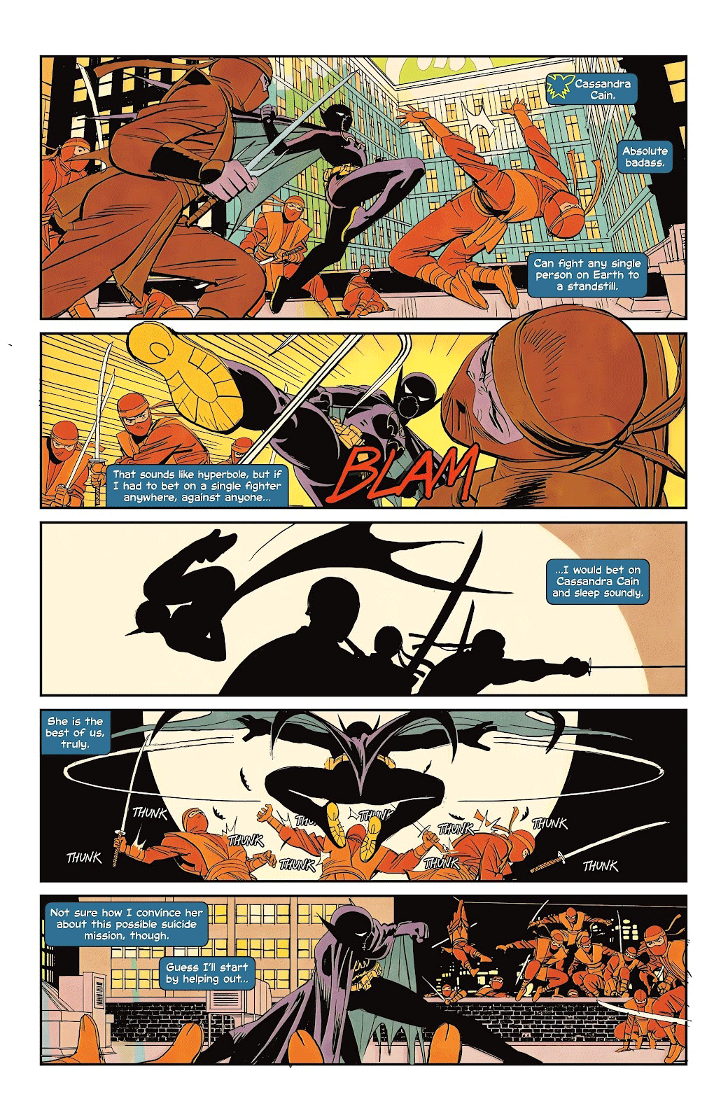
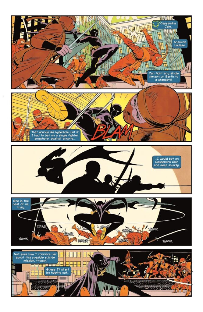
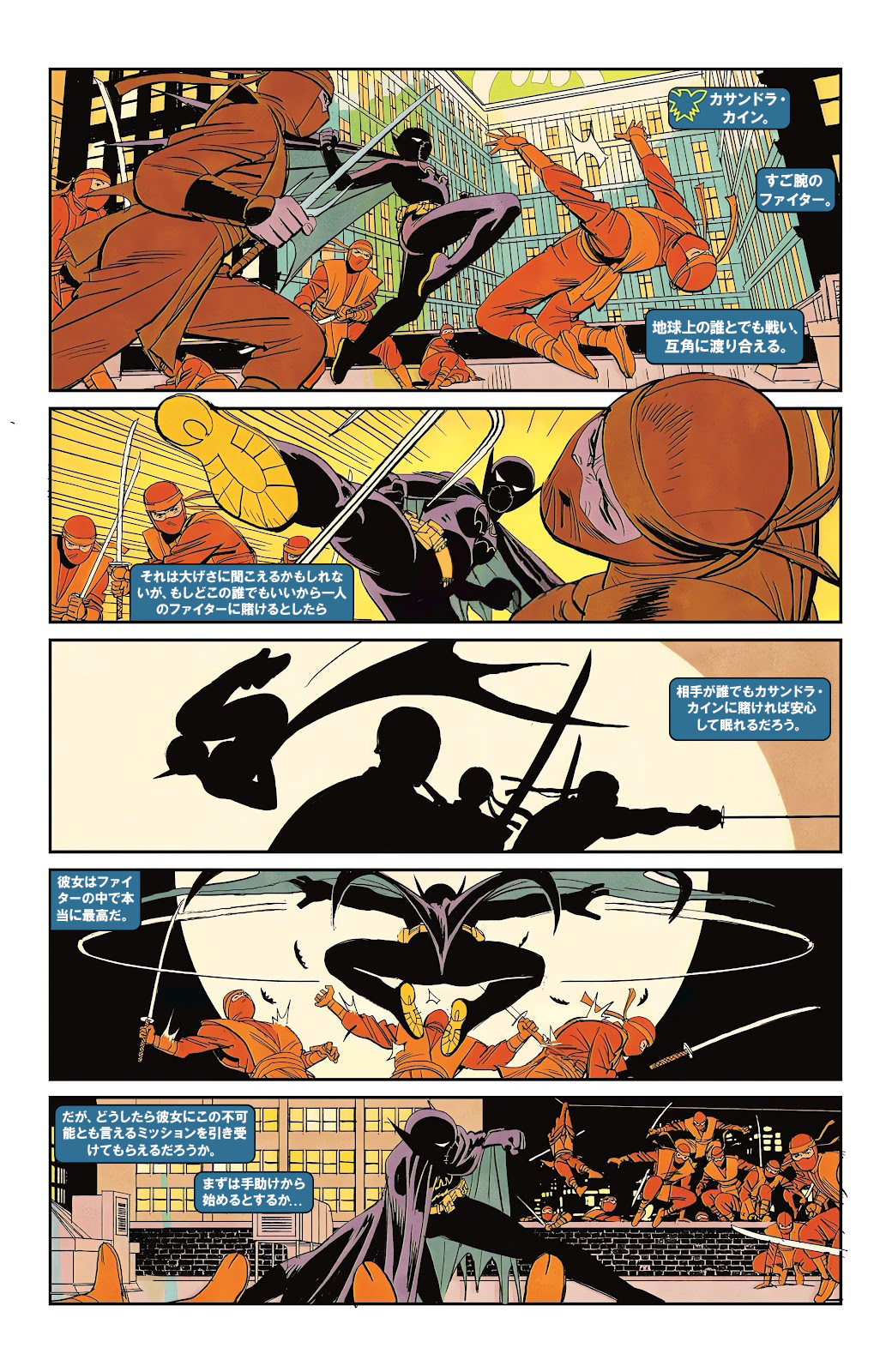
Do to my having recently re-discovered my love for comic books and comic book heroes, it was natural that when I wanted to hone my DTP (Desktop Publishing) skills, I would feel inclined to localize a comic book page. The biggest issue (pun intended) at the start was choosing which comic book page out of the hundreds that are published every week to work with. After combing through all the recent issues, I found the perfect candidate: The introduction of Cassandra Cain in the most recent run of the comic series Birds of Prey.
What can I say? She’s my favorite member of the BatFamily and she’s just so cool. Oh and before I forget, I should probably get this out of the way.
DISCLAIMER: Copyright Disclaimer: under section 107 of the Copyright Act of 1976, allowance is made for “fair use” for purposes such as criticism, comment, news reporting, teaching, scholarship, education, and research. This project is a proof-of-concept, and as such does not represent nor infringe on the creator(s) in any way.
Without further, let’s dive into this project by first getting an overview. Oh and special thanks to Aloha Komatsu for being my Japanese reviewer!
The Friendly Overview
If you like visuals, here’s a simple visualization of how I went about this project and what programs I used.
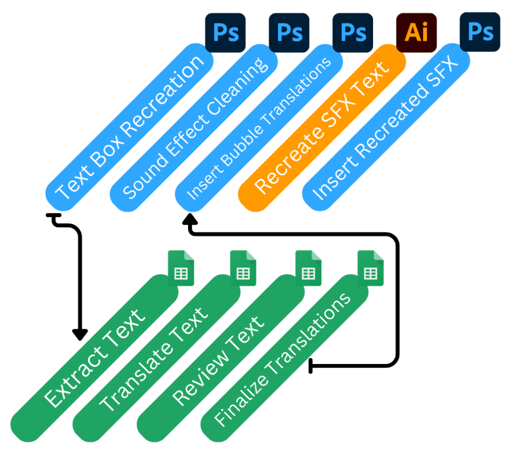

If you’re more of a fan of the written word, I’ve listed out each tool and step below.
Tools:
I primarily worked with these three applications in order to complete this project:
Google Sheets
For translation and review
Adobe Photoshop
For creating adjustable bubbles, editing out SFX, and inserting translated text
Adobe Illustrator
For creating stylized Japanese SFX text
Workflow:
These are general descriptions of the steps I took to complete this project.
DTP
- Create new, empty and adjustable text bubbles over the english bubbles
- Clean the SFX out and redraw where necessary
- Insert Japanese translations into the bubbles
- Create the stylized Japanese SFX text
- Insert the SFX text
Translation
- Extract text from bubbles and sfx into a spreadsheet
- Translate text
- Send translations to reviewer
- Finalize translations
If you’re curious about each of these processes in more detail, make sure you check out the Nitty Gritty section below!
The Nitty Gritty (DTP)
Acquiring the asset
Ok. I’m going to level with you. I could have found a high quality scanner, scanned the comic page, straightened it all up and made it look like a digital copy, and used that. That whole process would have introduced a lot of imperfections, however, so in order to work with the highest quality of raw file I could, I knew that it would be best to find a high quality, yet legally questionable rip of the page in jpeg form online. Keep in mind, as mentioned in my disclaimer, I did this all for educational purposes only. Also I do, in fact, own the physical comic itself, so that’s got to count for something, right?
Making some new boxes
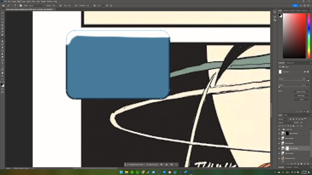
The first thing to do was to make some new text boxes that would replace all the current boxes. You might be wondering, why make new ones instead of simply clearing out the existing ones? The answer is simple. I can control and resize any new textboxes I make, but not the ones that already exist. When I put Japanese text in, I don’t know how it will appear, if it will expand or contract, or if it will need to be made larger. Regardless, if I were not able to resize boxes, I would be stuck twisting and contorting the Japanese text to fit into the existing boxes, and that wouldn’t be good localization.
Overall the process was as simple as drawing out new boxes using the rectangle tool, changing their fill color, and playing with corner radii until it was hard to tell which boxes were new and which were old.
For the canary symbol in the first box, I copied that whole box into a new layer and then used a mask so that the canary symbol was more or less isolated. I then took that isolated layer, positioned it in the corner of a box I created and then merged the two layers (box and symbol). As one merged layer, the canary symbol would expand and contract with the box itself. Neat.
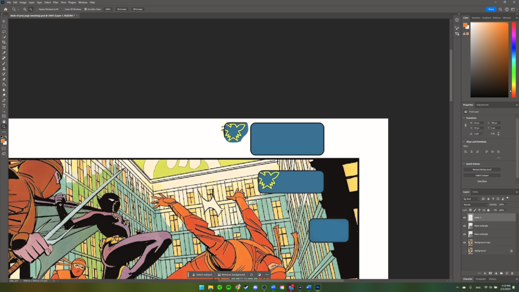
For the boxes in the corners, I made a full sized box that was lined up with the existing one and then used a mask to hide the part the overflowed outside of the panel.
Getting rid of the SFX
This was by far the longest part of the whole process. I knew the Japanese translations of the BLAM and THUNK sound effects would look far different and wouldn’t be able to fully hide the English if they were overset. This meant that I needed to fill in all of the SFX to create a base copy which I would then put the Japanese text on. While the methodology was simple, the execution was difficult and time consuming. For the uncomplicated large areas, I filled in the text with the paint bucket tool.
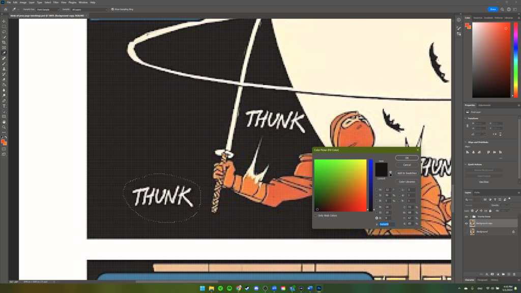
For the complex places, I flexed my mouse art skills and used the paint brush and color selector tools liberally.

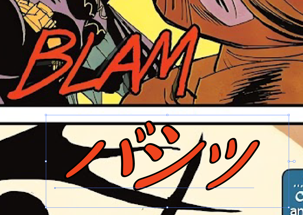
Making new SFX
I knew there were more text transformation options in Adobe Illustrator than PhotoShop, so I booted it up and set the original, unedited comic page as my background. I then typed out the SFX translation, made it the right size as compared to the original, and chose the font that best suited the feel. I then messed with the leading and kerning and also made good use of the free transform tool to get Japanese versions of the SFX that I was happy with.
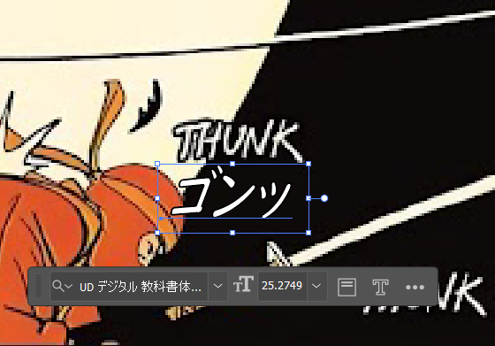
Inserting the translations
I’ll go into the translation more later, but suffice it to say that I had a spreadsheet with the Japanese translations available. Putting the the translations in was a simple matter of first selecting a font, the infamous 創英角ポップ体 font, which can be considered the Japanese Comic Sans, drawing area text boxes, and pasting the translations into those boxes. After that, I did some resizing of the text, messed with the typography features, resized the textboxes, and inserted natural line breaks so that it would all look and flow naturally.
Inserting the SFX was easier than I thought and involved me copying the layers in Illustrator and pasting them into PhotoShop. Did you know you could do that? I didn’t, and I was thrilled to find out. For the couple of THUNKs that dip behind Cass’ feet and legs, it was easy to use a mask to hide the right areas and make it look good.
That’s all, folks
And that just about covers it! If you want to check out what the main file looked like at the end of each step, you can check out each step individually by clicking on the images below; otherwise, check out the animated GIF (bigger size up at the top).


The Nitty Gritty (Translation)
While I originally had planned on using Smartcat TMS as my primary method of tracking translations, I ultimately spent more time on Google Sheets. With such a small amount of words and only one reviewer, it wasn’t necessary to mess with a TMS to create a robust workflow and QA system. If I were to do an entire comic book in the future, I would absolutely want it all in a TMS with a glossary and TM, but for the scope of this project, I determined that it was a bit overkill and stuck with my detailed Google Sheet. Here’s what it looked like.
The workflow followed the logic in the spreadsheet.
- I extracted the strings in the English and put them into the first column.
- I translated the strings and wrote my translations into the second column.
- I wrote any notes that I thought might be useful for the reviewer into the third column.
- I sent the sheet, along with the original page for context, to my reviewer, big thanks again to Aloha. She wrote me some notes and made corrections in the fourth column.
- I finalized the translation in the fifth column and then got my reviewers approval.
- I sent the final copy with all the translations inserted to my reviewer for the final signoff.
Overall I have to say the whole translation process went off without a hitch and I feel confident in my final translations.
Final Thoughts
All in all, outside of ditching the TMS, this project proceeded like how I imagined it would. My planned workflow worked well and allowed me to have concrete steps to work toward and iterate on.
One mistake that I would rectify if I were to do a project like this again was how I handled the redrawing and SFX removal. I should have made a new blank layer to paint on, rather than just painting directly onto my working copy. The way I did it gave it an “all or nothing” feel, where I had to constantly ctrl + z every time I was unsatisfied. If I were working on a separate layer, I would feel more comfortable experimenting to get a better look because I wouldn’t be making any ‘permanent’ changes.
Finally, I want to mention how this project gets me excited about working in comic book localization. I really enjoyed playing in all the different programs and making decisions on how to best keep the style of the English copy but make it accessible in Japanese. At a comic book production company, I imagine that SFX and text boxes are added in a separate step after the art is finalized, so in an ‘official’ comic book translation, the SFX removal and box re-creation steps I undertook would be unnecessary. You would probably just get the panels free of any text and some notes on how you should construct the boxes and SFX. At least, that’s how I hope it would work.
Anyway, if you’re still here, thanks for reading all the way down to the bottom! I hope you enjoyed reading about this as much as I enjoyed doing it. Till next time!